

How To Choose Your Colour Palette for Your Wedding Stationery
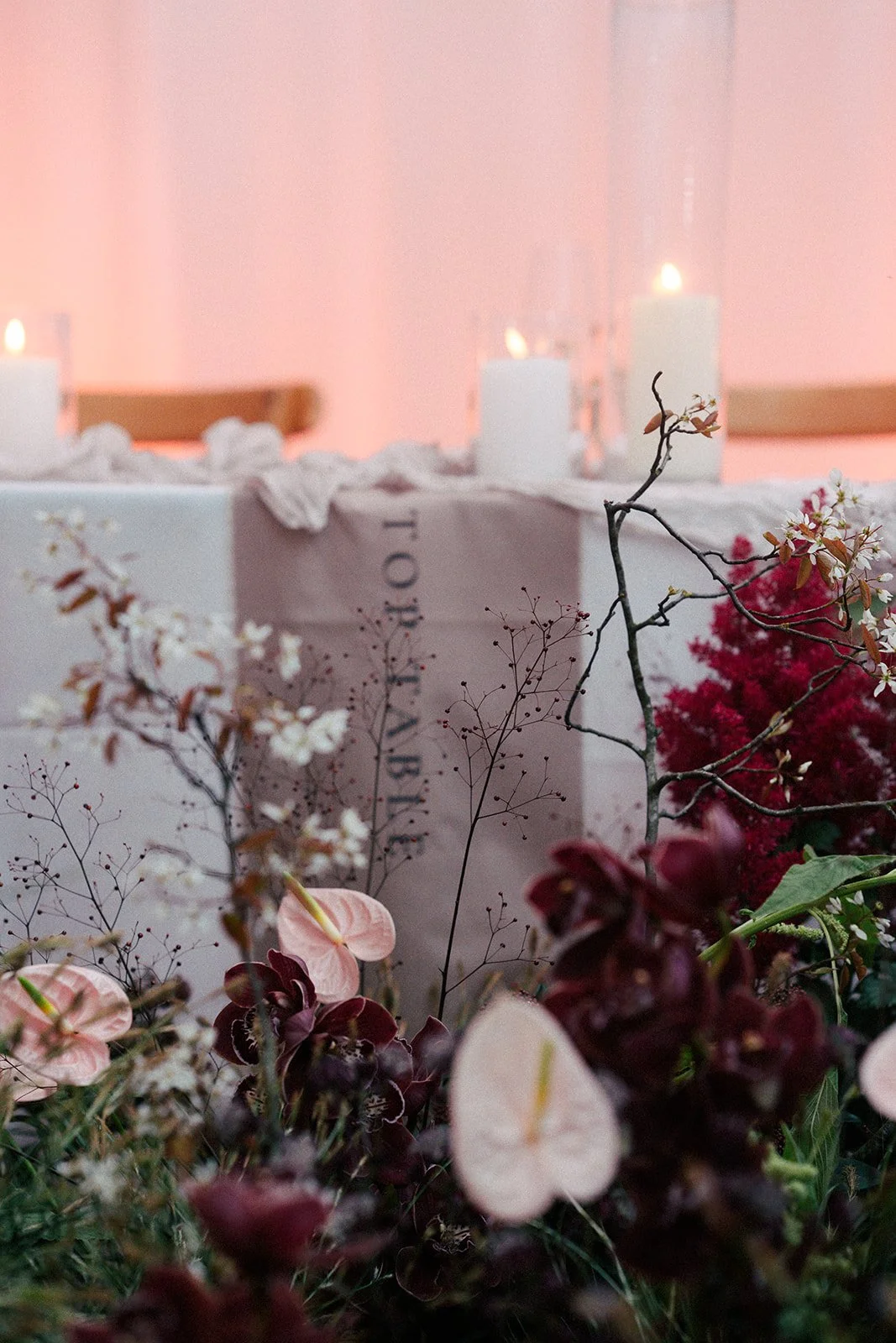
Colour palette for your wedding stationery
Choosing a colour scheme for your wedding feels like a big milestone, because you’re selecting the tones that will permeate literally everything on your day - your florals, your table decor, your stationery. But before anyone arrives at your wedding, the first thing they’ll receive is your invitation. This means that choosing your colour palette for your wedding stationery is a pivotal step that should be carefully considered. There are so many places you can look for ideas, and I’ve gathered 6 of them into one place to set your little cogs whirring.
![Images with Border [BELLADONNA].png](https://images.squarespace-cdn.com/content/v1/64a056d22b940243332373b5/1e1ff62c-baba-496c-bb3d-595c8470a5f0/Images+with+Border+%5BBELLADONNA%5D.png)

![Images with Border [BELLADONNA].png](https://images.squarespace-cdn.com/content/v1/64a056d22b940243332373b5/4835eeef-33d7-4892-8c71-df8da386f9b2/Images+with+Border+%5BBELLADONNA%5D.png)
6 places to gather inspiration for your wedding stationery colour palette
The season you’re getting married in
Look to the four seasons for inspiration for your wedding stationery colour palette and you’ll find there are two really fun ways to approach this - either choosing an aesthetic that really leans into it, or one that gives your guests something totally unexpected. Either way, it’s a great starting place to get the ideas flowing.
If your wedding is in spring or summer, you can effortlessly choose pretty pastels, vibrant brights and decadent jewel tones, and they’ll feel perfectly aligned with the blooming of new life and nature’s own gifts during this time of year. Warm neutrals are also an easy choice, and there are a thousand different directions we can go with these colour schemes in your wedding stationery.
You can also go beautifully rogue and decide to embrace a colour palette that wouldn’t traditionally be associated with your wedding season - a wintry take on pastels, for example, or swapping autumnal rusts and burnt oranges for something fresh and light like lime green or baby blue.
Start here and see if any of the seasonal (or anti-seasonal) colour schemes feel like a gorgeous fit for your wedding - if you’re not quite there yet, I’ve got 5 more inspiration sources for you!

Look to your venue to help decide your colour palette for your wedding stationery
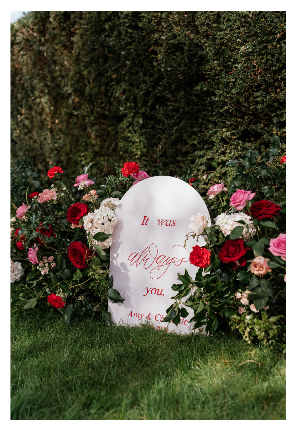
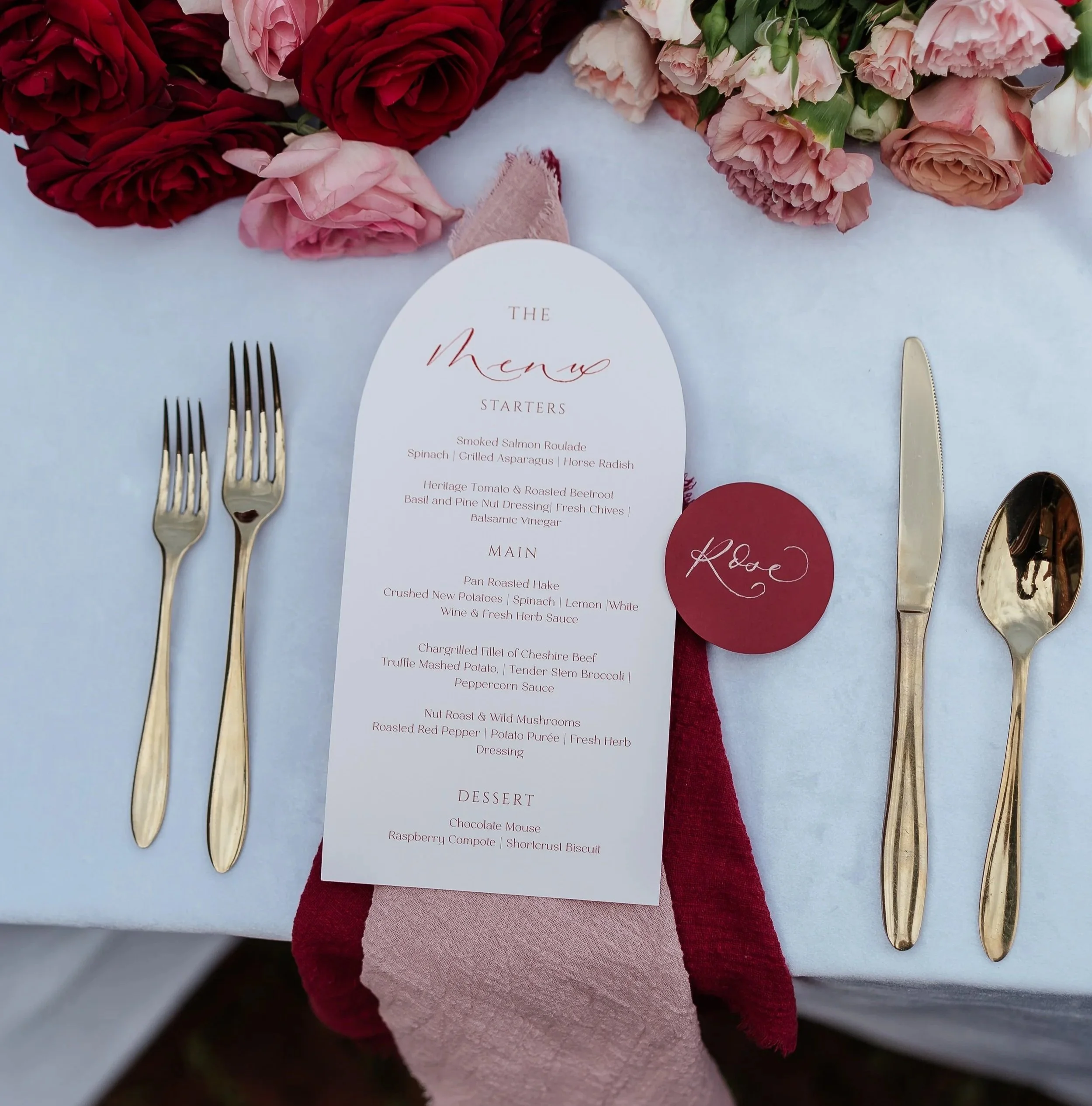
You’ve chosen and fallen in love with your wedding venue for a reason (probably multiple!), so it follows that your colour palette choice should be inspired by your setting. There are a couple of ways to think about this too; either by looking at your venue’s colours, features and vibe, or to the actual space itself you’ll get married in - be it an abundant English garden, a cliffside overlooking the ocean, or beneath a grand mosaic ceiling.
Think about the colours and patterns at your wedding venue - is there a ballroom with pastel tone walls or a space with Mediterranean tiles, for example? These are things you can pull from to weave through your wedding stationery, which also helps ensure everything feels intentionally and cohesively designed on the day itself. If your venue is a blank canvas with neutral walls and floors, you have complete freedom to let your imagination run wild with your stationery colours, my wonderfuls!
Which spaces are you using in your venue? If you’re having an outdoor ceremony followed by a marquee in the manicured, flower-filled grounds of a stately home, you might want to play on those summery garden colours for your stationery.
If you’re getting married among nature, I’ve pulled together some inspiration for your wedding invitation designs here.
Your wedding’s vibe will help determine your colour palette
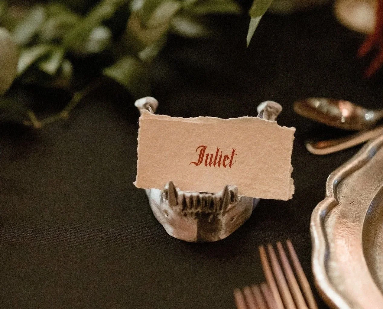
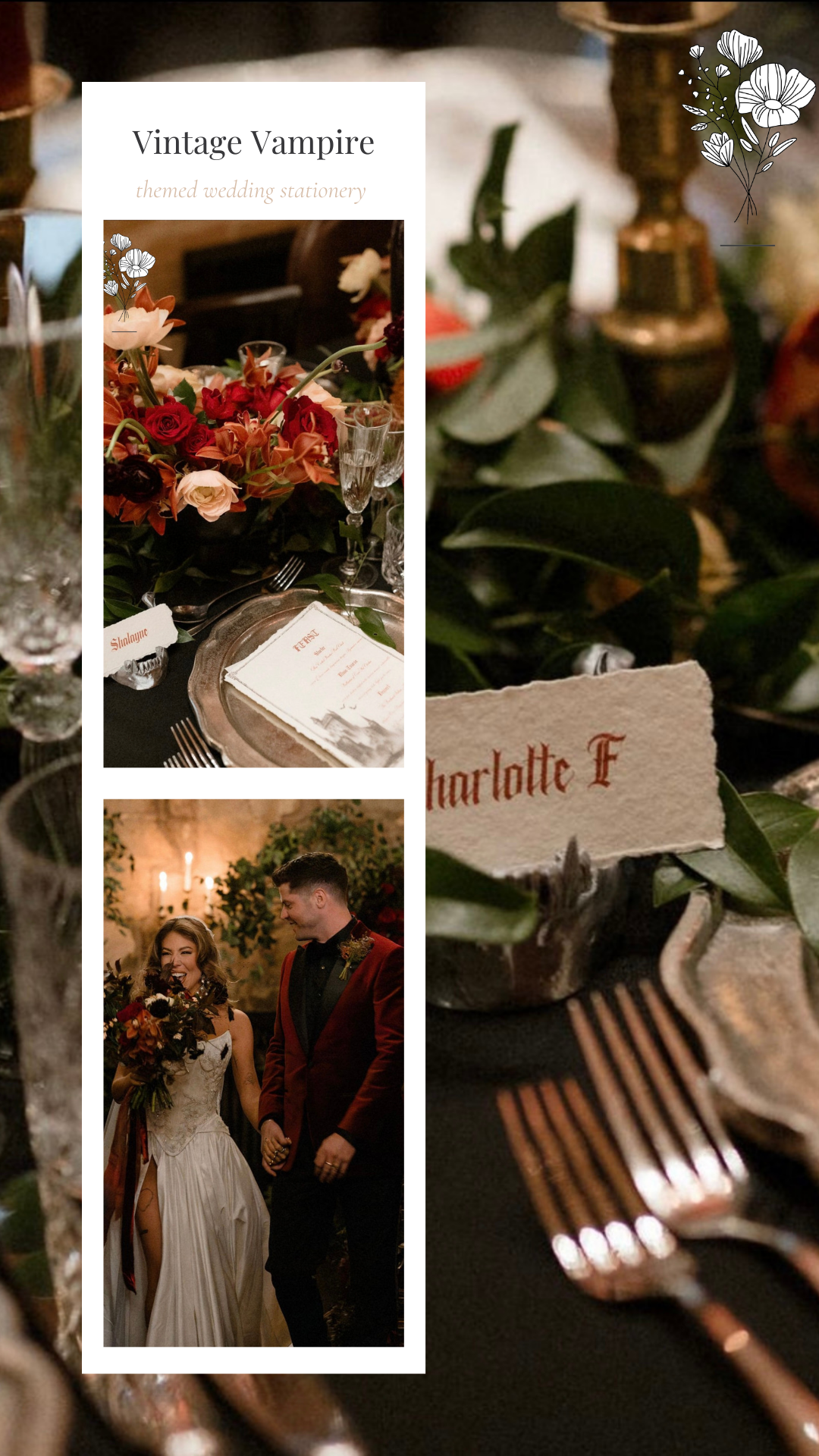
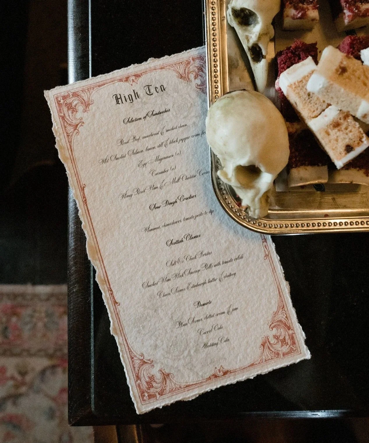
Couples are exploring more and more the idea of immersive, stylishly themed weddings with a strong sense of aesthetic - I just dived into the beautiful theatrical, gothic romance theme recently - and this is a really strong source of inspiration for your wedding stationery colour scheme.
Maybe you’re looking into a literary theme for your wedding just like Helen and Oscar or really turning it into a fun, floral wonderland. These themes will naturally suggest colour schemes, and in this instance I really recommend listening to what your concept is telling you!
What’s trending?
As a wedding stationery designer, I love to acknowledge trends. I’d never recommend following them just because they’re on trend, but they often give ideas and inspiration for new colour palettes you hadn’t yet considered or seen much before. In recent years we’ve had Pantone’s peach fuzz and mocha mousse, a red renaissance and a butter yellow moment, and in 2026 I’m expecting to see lots of greens and blues taking centre stage.
You might like to look at my colour style guides for:
The best thing you can do is bring your stationery designer ideas based on trends you’ve seen and loved, and let them craft you something bespoke and unique that uses them as influence but puts your own personality front and centre.
Get inspired for your wedding stationery colour palette by your designer’s previous work
Once you’ve chosen your wedding stationery designer, browse their previous work to get a feel for what they do really well. If you love something they’ve made for a previous couple or a semi-custom option, you can ask for their advice on which other colours would work well for those sort of designs!
Last but not least…your own creative spark
If you’re a creative little soul, you’ve probably got lots of ideas already - so run with them! Whether that’s a whole vision for your wedding or just one colour thread to pull on, let your stationery designer know all your ideas and they can pull it all together.


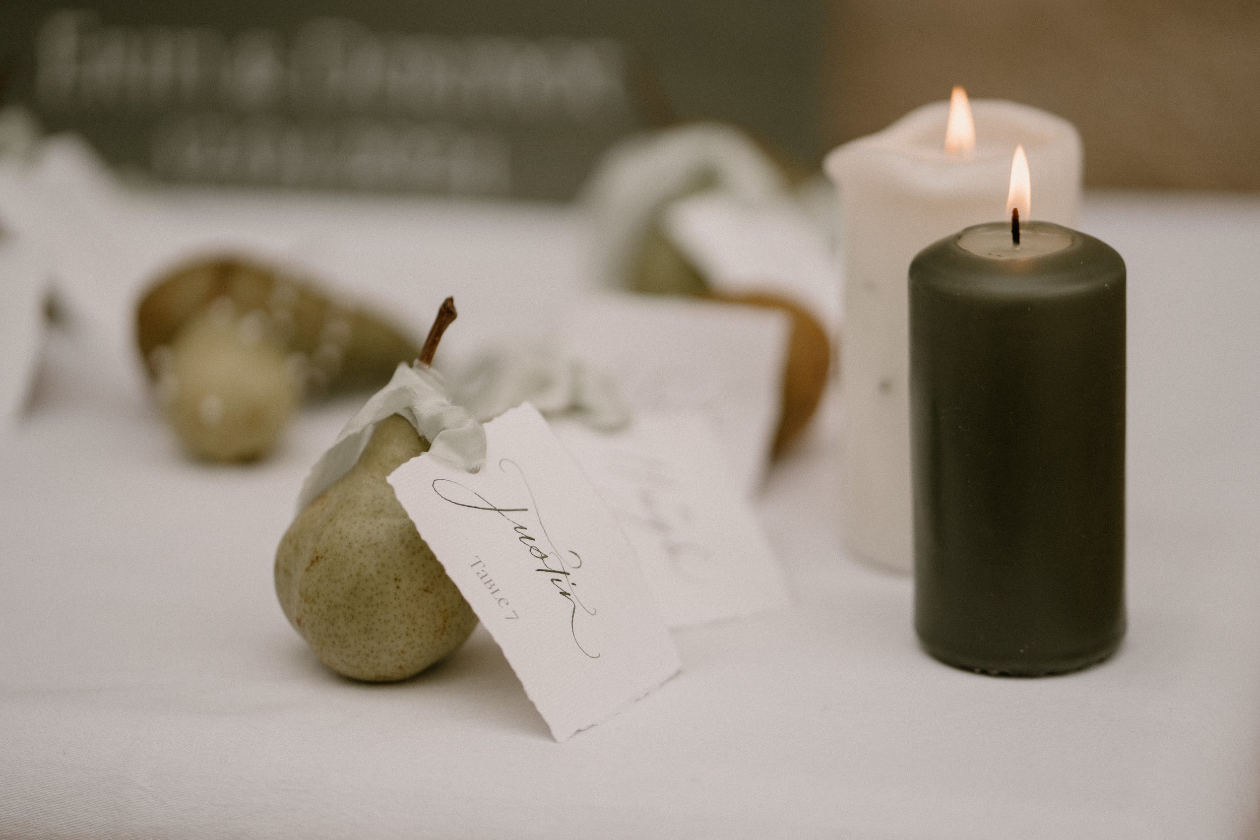
GET IN TOUCH if you’d like to work together on your perfect wedding colour palette and stationery that does it justice - I’m a lover of everything from soft pastels to strong precious stone colours, so I’m already excited to hear what lights you up!
MUCH LOVE,
Sophie
x
Special thanks to:
Emma Olivia Photography
Louise Eleanor Photography
SunshineSEOStudio